
WEB DESIGN · · 8 min read
How to build a directory website people trust: lessons from Where I Do
What it takes to build a directory website people trust and Google ranks, from hand-checked data and listing pages to SEO and a fair business model. Seven lessons from a 418-venue build.
 Rhys · Digital Manager
On this page
- The short answer
- Why build a directory at all?
- Lesson 1: find the question nobody answers
- Lesson 2: real data beats more listings
- Lesson 3: design the listing page around the first call
- Lesson 4: make comparing the default
- Lesson 5: help people who don’t know where to start
- Lesson 6: a list nobody can buy
- Lesson 7: build a page for every way people search
- What it takes to build one
The short answer
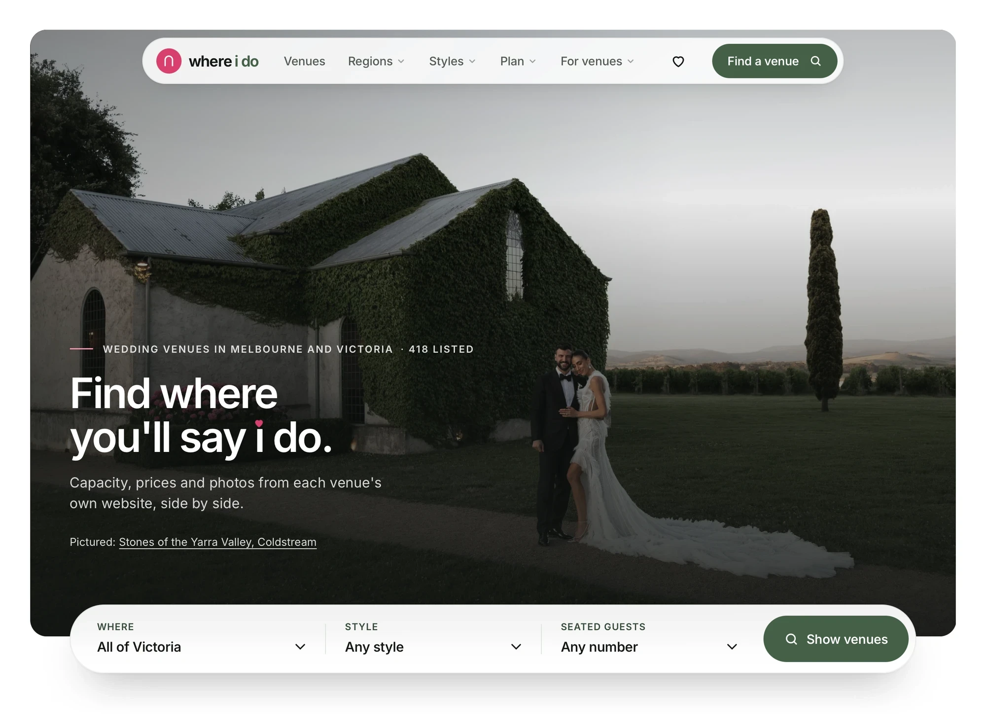
A directory website earns trust when it answers the question people can’t easily answer anywhere else, shows the same facts in the same place for every listing, and makes it obvious that the order can’t be bought. It ranks when there’s a genuinely useful page for every way people search, built from real data rather than templates stuffed with keywords. Those ideas sit behind Where I Do, a directory of 418 wedding venues across Victoria that we designed and built.
Why build a directory at all?
Directories work when information is scattered across hundreds of separate websites and each one presents it differently. Wedding venues are a good example. Couples want to know three things early: will it fit our guests, roughly what will it cost, and what does it look like? Answering that usually means opening dozens of tabs, downloading PDF packages and filling in enquiry forms just to get a price.
A directory that puts those answers side by side saves people hours. That’s the whole job, and every decision on the build came back to it.
Lesson 1: find the question nobody answers
Before designing anything, every venue’s own website was checked by hand. What came back shaped the product: only 22% of Victorian wedding venues publish a starting price, and 54% publish neither a price nor a capacity.
That gap became the reason for the site to exist. If most venues won’t say what they cost, a directory that shows prices where they’re published, and says clearly where they aren’t, is genuinely useful. Every industry has an equivalent: the thing customers always ask on the first phone call.
Lesson 2: real data beats more listings
It’s tempting to launch a directory with thousands of thin, scraped listings. Where I Do went the other way. Every listing was checked against the venue’s own website, the photos are the venue’s own and credited back to them, and each page shows when its details were last checked.
Fewer, better listings are easier to trust and easier to rank. Google’s guidance on helpful, people-first content favours pages that show real effort and first-hand information, which is exactly what a hand-checked listing is.
Lesson 3: design the listing page around the first call
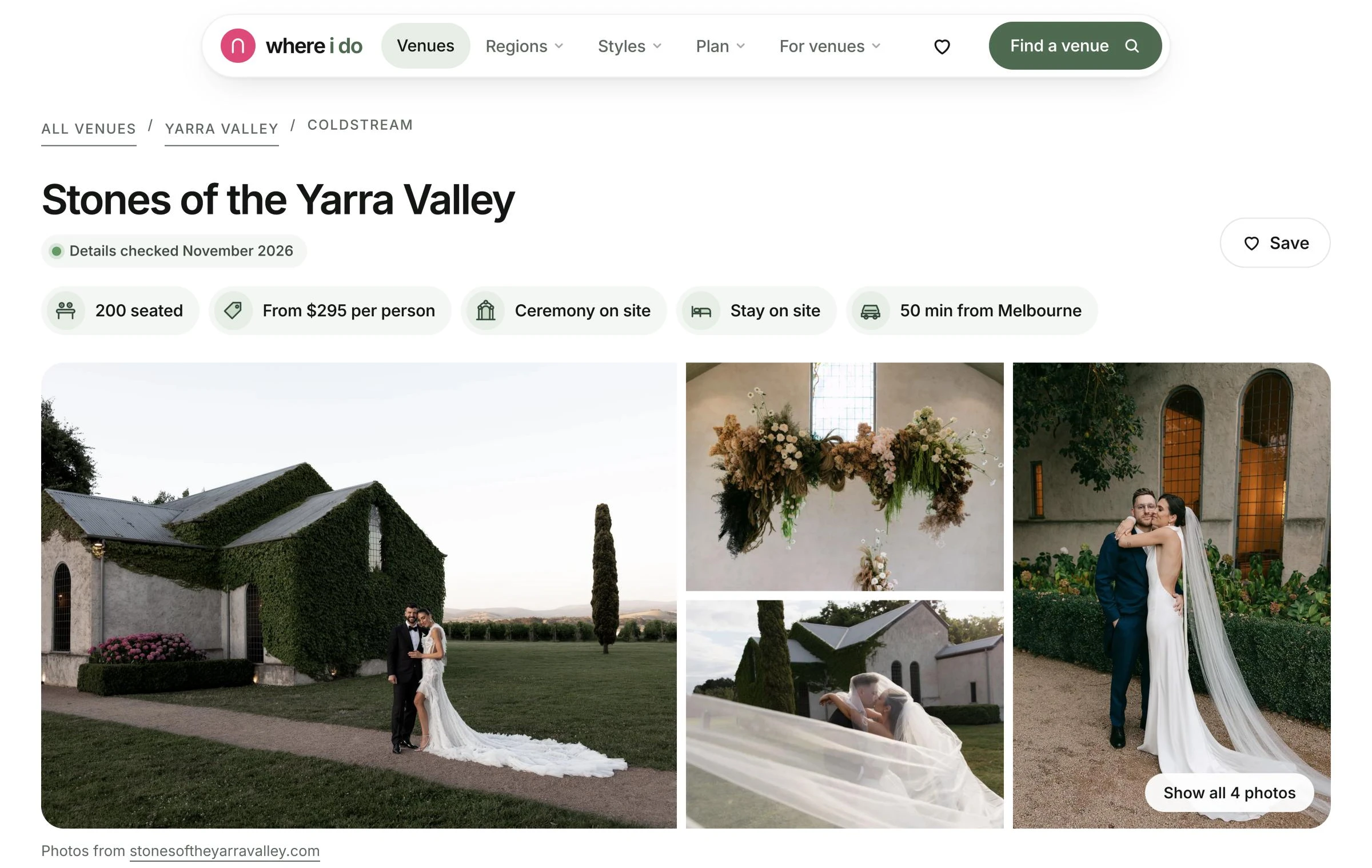
The venue page is the most important page on the site, so it was designed around the questions couples ask on a first call. Capacity, starting price, whether there’s a ceremony on site and whether there are rooms all sit at the top. Then come the venue’s photos, an honest take from the Where I Do team, the practical details people ask about, like catering, finish times and wet weather options, and how the venue compares with others in its region.
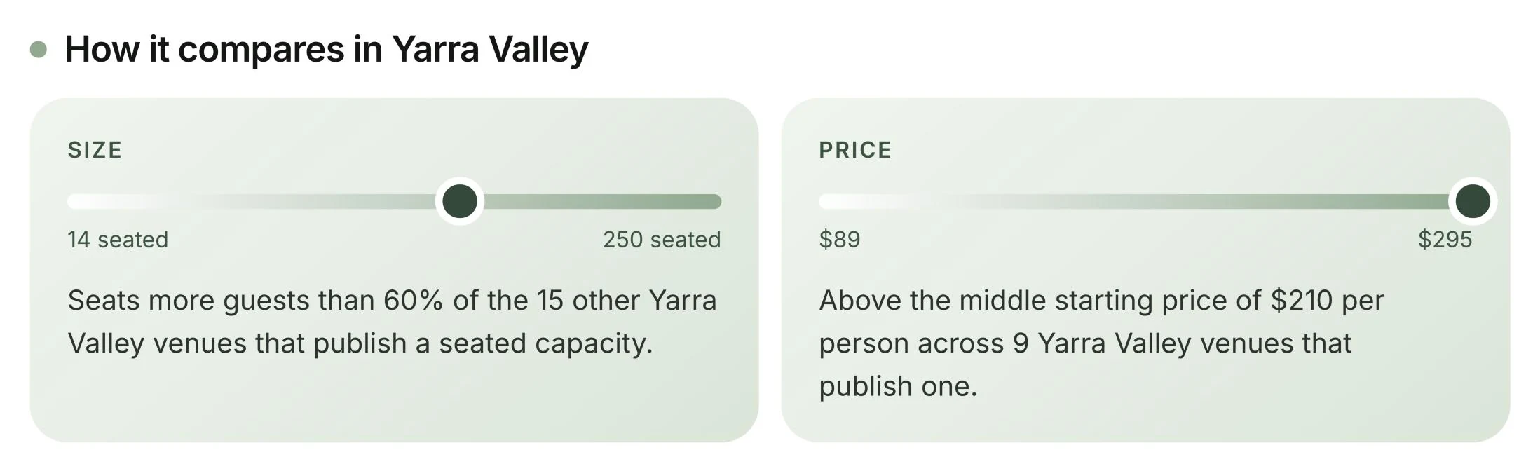
The comparison panel does a lot of quiet work. Seeing that a venue is bigger or more affordable than most in its region tells couples more than a paragraph of description ever could.
Lesson 4: make comparing the default
Every venue card shows guest numbers and a starting price in the same position, so scanning a list feels like reading a table. The regions menu leads with venue counts, and popular searches show how many venues match before anyone clicks.
Consistency is a design decision, not a data one. If one listing shows its price up front and another hides it in a paragraph, people stop trusting the whole list. It’s the same principle behind a clean, modern UX on any website: put the answer where people expect it.
Lesson 5: help people who don’t know where to start
Not everyone arrives knowing which region or style they want. Venue match asks five questions and returns a shortlist with the reasons each venue made it. Alongside it sit a cost calculator, a budget planner, a printable visit checklist and a map of every venue.
Tools like these give people a reason to stay, come back and share the site. They also earn links in a way listing pages rarely do.
Lesson 6: a list nobody can buy
The quickest way to lose trust in a directory is to let money decide the order. On Where I Do, couples never pay and venues never pay to be listed. Fuller listings rank first. Two clearly labelled extras, a $49 a month premium profile and a $79 a month sponsored spot, pay for the site, and neither can move a venue up the main list.
Enquiries go straight to each venue’s own website as well, so the directory never stands between a couple and the venue. If you’re planning a directory, decide how it makes money before you design it, and make that model visible on the site.
Lesson 7: build a page for every way people search
Directories live or die on search. Where I Do has a page for each of its 26 regions and 11 styles, plus pages for the searches couples actually make: BYO venues, dog-friendly venues, venues for 100+ guests, waterfront venues, accessible venues and more. Each page is built from the directory’s own data, with real venue counts, so none of them are thin.
On top of that sits original research. The Victorian Wedding Venue Report 2026 uses the directory’s data to show things like how many venues publish a price in each region, with 39% in the Yarra Valley compared with 13% in the Dandenong Ranges. Research like this is what other sites cite and link to, and it’s only possible because the data was collected properly in the first place. Our guide to getting your business recommended by AI explains why original, specific information matters more than ever.
What it takes to build one
A good directory is part website, part database and part SEO project. The work usually looks like this:
- Research: what people need to compare, and where that information lives today
- Data: collecting, checking and structuring every listing, with a way to keep it current
- Design: listing pages, search and filters, and tools that help people decide
- Build: fast pages that can grow from hundreds of listings to thousands
- SEO: region, category and search pages, structured data and a plan for original content
- Business model: how it makes money without undermining trust
That covers branding, web design, software and web apps and SEO, handled by one team from the first sketch to launch. If you’re weighing up whether your idea needs a website or something closer to software, start with our guide to whether you need a website or software.
For the full visual story, see the Where I Do case study or browse all our work. We’ve also written up what we learned building Openy, a SaaS product for real estate agents.
Got a directory or marketplace idea? Book a call and we’ll help you work out what to build first.
Book a 20 minute call
WRITTEN BY
Rhys · Digital Manager
Years on the client side, from global brands to local businesses. Leads strategy and creative on every Sault Digital project.